| 2017-04-18 | 小编:史凯齐 | 6 |
雅思的Task1规定至少写150个字,字数不够当然要扣分,但是写多了也不会因为字数额外加分,有些考生会在小作文上花30分钟、甚至35分钟,导致分数比重更高的大作文时间不够,最终低分。教学中遇到学生最多的提问之一就是:如何在15~18分钟把图表作文写完?经过多年的摸索发现:考场上要学会变通,不同类的图写法有明显差异。
例如下图:
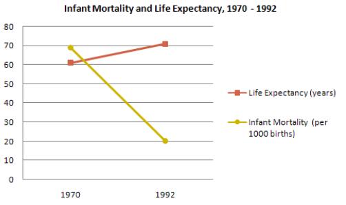
以黄色的Infant Mortality这条线为例,我们可以有至少四种写法:
1.普通写法:
The number of infant mortality dropped dramatically, from 70 per 1000 births in 1970 to only 20 in 1992.
2.There be句型:
There was a dramatic drop in the number of infant mortality,from 70 per 1000 births in 1970 to only 20 in 1992.
3.主动语态:
Infant mortality experienced a slump,with the number falling from 70 per 1000 births in 1970 to only 20 in 1992.
4.被动语态:
A sharp decline could be observed from the figure of infant mortality. More exactly, it stood at 70 per 1000 births in 1970 ,but slumped to only 20 in 1992.
当我问到学生这四种写法哪一个最加分的时候,绝大多数同学都选第四种,也就是越啰嗦越加分。
那我们再看看剑桥真题集里考官的范文是不是按照这个思路写得呢?
以剑6第一篇图表作文为例(P30)
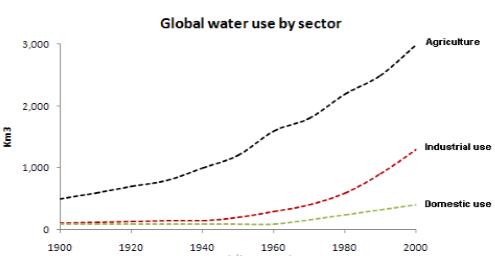

考官范文先写了线状图当中的极大值Agriculture那条线,内容如下:
Throughout the century,the largestquantity of water was used for agricultural purpose,and this increased dramatically from about 500km?to around 3000 km? in the year 2000.
在与上面四种写法对照之后发现,考官居然用的是最短最简单那个。原因也很简单,剑6这是一个组合图,数据比较多,假如用第四种写法的话,20分钟显然是不够用的。或者我们反过来思考,假如把剑6组合图中的表格去掉只剩下线图的话,第一种写法又凑不够字数。
所以,到目前为止我们可以得出:图中数据的多少决定了写法的简易程度。
为了证实我们的结论,不妨再举一例。以剑8的饼状图(P53)来说。
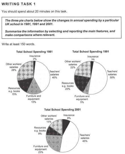
许多同学力求精确、详细甚至完美,所以极大值Teachers' salaries就会写成这样:
Teachers' salaries had occupied the largest proportion of school's total expenditure throughout this period. It stood at 40% in 1981, while after a 10% increase during the next decade the figure peaked at 50% in 1991. Then, the spending dropped by 5% to 45% in 2001.
多达46个单词。
再看看考官的写法:

我们可以看到范文第二段用仅仅49个字不但写了Teachers' salaries,还写了Other workers'salaries. 而且考官并没有过多强调细节,就连极大值Teachers' salaries的起点40%都没写,因为只有这样才能在20分钟之内写完。假如按照上面一组数据46个字的标准来写,这个饼图五组数据加起来会超过大作文字数。
所以,对于数据过多的图表作文,我们描写的时候应该长话短说,废话少说。
六组以上数据的写法:
个别时候会遇到极其变态的多数据图,例如剑9六线图(P101)
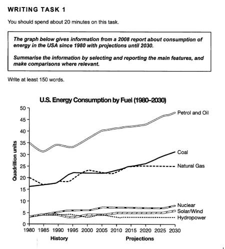
这么多条线如果不大刀阔斧地合并的话,30分钟都写不完。我们看看考官范文如何处理
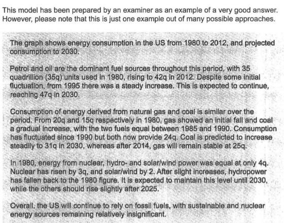
六条线被考官合并为三条,中等高度的两条放在一起写,最低的三条放在一起写。
现实考试中,比例最高的是柱状图,来看一个多数据柱图。
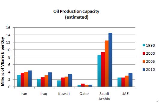
The graph shows estimated oil production capacity for several Gulf countries between 1990 and 2010.
范文:(重点在合并)
The graph shows Oil Production Capacity in millions of barrels per day for selected Gulf countries. There are several features in this graph.
The most significant feature is that oil production will increase sharply in almost all the countries shown. Kuwait and Iraq are both expected to double their output between 1990 and 2010, with Kuwait's production rising from 1.8 million barrels per day (bpd) in 1990 to 3.8 in 2010. Iran will also increase its output by a slightly smaller amount.After remaining steady at 2.5 million bpd from 1990 to 2000, the UAE's output is expected to approach 4.0 million bpd in 2010. Only Qatar's production is predicted to fall, back to 0.8 million bpd after a slight rise in 2000.
However, the greatest increase will be from Saudi Arabia. In 1990, its output capacity at 8.5 million bpd exceeded the combined production of Iran, Iraq and Kuwait. This lead is expected to continue with a 75% increase in production to 14.5 million bpd 2010.
In summary, while most of the countries are expected to show increases, Saudi Arabia will maintain and strengthen its position as the major producer.
(191 words)
范文中伊朗、伊拉克、科威特三国的趋势特征都有写到,但是具体的数值只写了科威特。
所以,六组以上数据的名字和特性都必须要写到,但是具体数值选择性描写。
深圳市环雅外语培训中心 版权所有
客服信箱:fuhongyang@pxjy.com
Copyright © 1997-2024 Global Education. All rights reserved.
京ICP备10036718号 | 京公网安备 11010802017201号


